
A user-centred opening
People navigate spaces with habits, not manuals; good signage simply respects that. For building managers and designers who care about how a person feels in a corridor, tactile signage and clear wayfinding matter more than flashy screens. Practical choices — legible type, consistent visual hierarchy, and properly fitted braille plates — cut hesitation at the door. For those specifying for bedrooms, lifts or suites, consider ada braille signs early in the layout phase so the flow of movement is thought through, not tacked on.
What users actually need
Start from the human step: eye level, walking speed, and the angle of approach. A strong contrast ratio lets information read at a glance; tactile signage offers a second, reliable channel. Mounting standards matter — a sign too high or recessed creates a blind spot. Designers who test prototypes with real users often find one rule holds: redundancy is gentler than ambiguity. That means a mix of digital cues and physical markers, not one or the other.
Design patterns that reduce hesitation
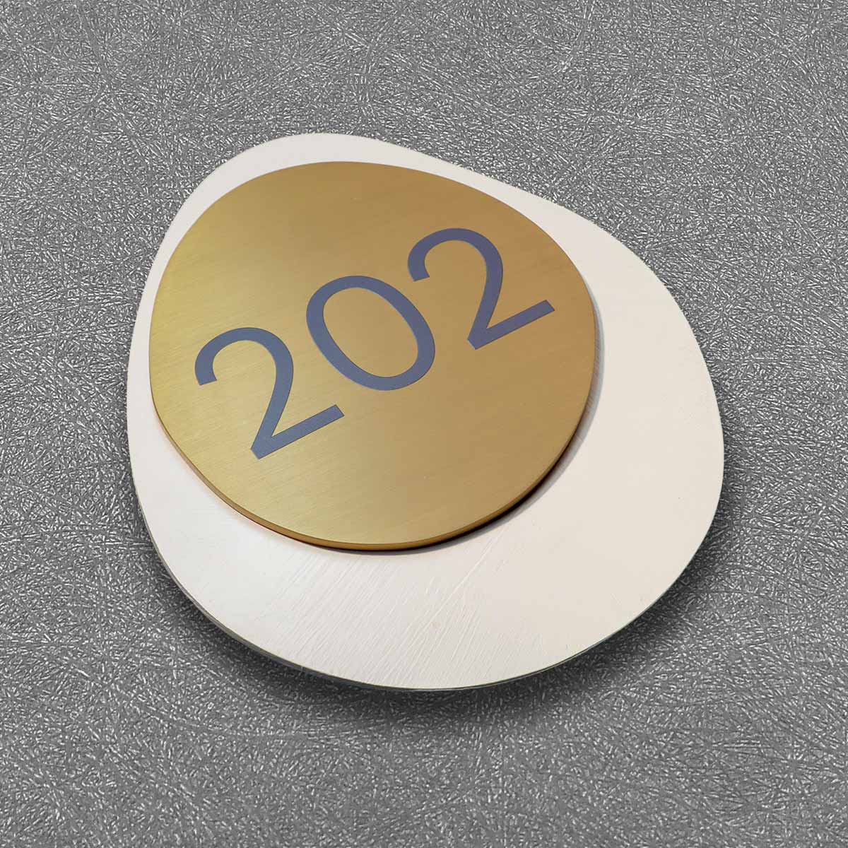
Think of directional flow as choreography. Digital panels announce the next move while durable plaques confirm it. Use a primary visual cue — colour or icon — repeated at intervals so pedestrians stop trusting memory and start recognising rhythm. Include a braille plate and tactile indicators at doors and at decision points; they’re inexpensive and highly effective. Dublin Airport’s terminal upgrades, for instance, leaned into consistent icons and improved tactile markers during recent wayfinding work — a useful real-world anchor that shows good decisions scale from small foyers to major hubs.
Common mistakes and quick fixes
Top issues crop up again and again: competing screens, too many typefaces, glare from finishes. Acrylic substrate can look tidy but it throws glare in bright atria — swap to matte or use anti-reflective face treatments where glare is a problem. Don’t cluster directional messages; give each a clear breathing space. And don’t forget door-level needs — ada braille room signs belong beside handles, not off-centre above them.
Short case: a corridor that learned to be kind
A hospital corridor I walked with a facilities manager last year showed how small changes matter. They replaced a row of inconsistent panels with a single system: consistent iconography, improved contrast ratio, and tactile signage at every patient room. Nurses stopped backtracking. Patients moved with less alarm. — A simple retrofit, nothing heroic, but it changed the daily rhythm.
Three golden rules for choosing custom-molded digital signage
Rule 1 — Legibility first: measure visual contrast and type size against typical sightlines. A measurable “visibility score” beats opinion every time.
Rule 2 — Multi-sensory redundancy: pair screens with tactile signage and a braille plate where people pause or decide. Physical confirmation reduces errors and speeds flow.
Rule 3 — Integration not ornament: match mounting standards, minimise reflective glare and test at walking pace. Ensure wayfinding logic is continuous from arrival to destination, from exterior to interior.
Wrapping the practise into procurement
When you brief suppliers, demand prototypes and on-site trials. Ask for samples of finishes, request compliance notes for ADA where relevant, and check that digital content follows the same visual hierarchy as the physical plaques. Vendors who offer custom-molded solutions that respect tactile constraints will save you retrofit costs later.
Closing advisory and final thought
Choose suppliers who demonstrate measurable outcomes: user testing results, compliance documentation, and a track record of installations in busy public buildings. Those three metrics will tell you whether a solution reduces confusion or simply adds another sign to the wall.
ada braille room signs are not an afterthought — they’re part of the directional grammar that keeps people moving, calm and sure-footed. For pragmatic, scalable work that respects both sight and touch, look to firms who design signage as choreography and structure. Cosun Sign. Clear, tested, and built for the way people actually move — a small change, a big difference. —

